
To most of the world, “Ugly Betty” was the name of an ABC original TV series starring America Ferrera. However, in the world of fundraising professionals, an ugly betty is an effective way to renew gifts from prior donors using a very direct, invoice-style approach.
So, is an ugly betty ugly?
No! An ugly betty is simply an invoice-style appeal. Although it may not include many photos, there are plenty of creative elements that can be used to grab donor attention and increase participation.
What’s so effective about an ugly betty? When donors look through their mail, something that looks like an invoice or bill will drive them to open it immediately or set it aside for future review. Consumers are inclined to pull out the “more important” pieces of mail to make sure that they don’t miss any official documents.
You might ask, “Why wouldn’t every appeal be an invoice style, then?” If every appeal were an invoice style, it would reduce its effectiveness. Many organizations send ugly betty mailers towards the end of their fiscal year to capture prior donors that haven’t given yet.
3 components to consider:
1. Creative
The effectiveness of these invoice-style appeals can be heightened with eye-catching, modern, and action-driving creative elements.
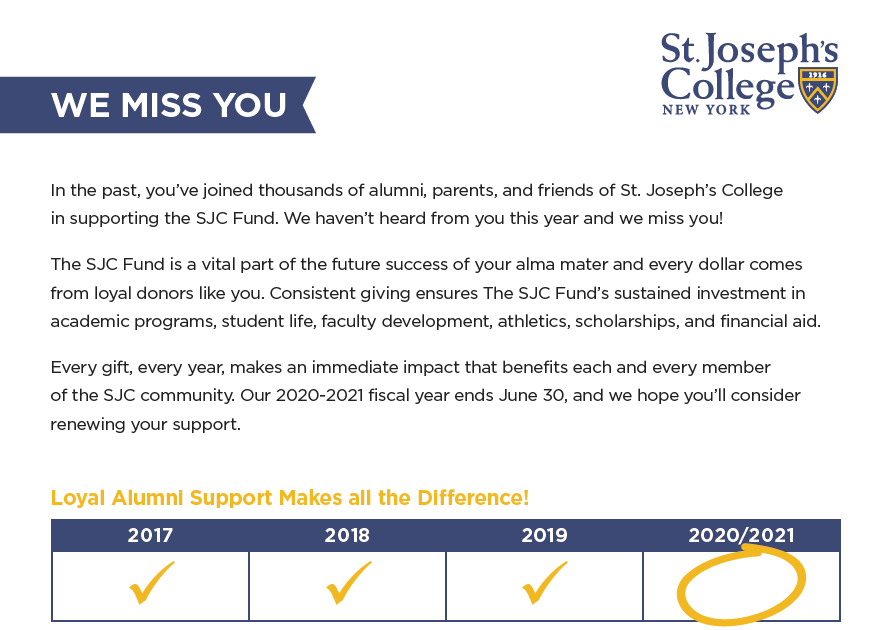
The invoice-style appeal often emphasizes prior giving, lack of giving this fiscal year, and a strong call to action to donate. That simple message combined with a superior design is a winning combination.
Check out some examples sculpted by our creative team.
2. Envelope type
How do you know when you get a bill in the mail? There is usually a special type of envelope or design that evokes urgency. Whether it’s a window envelope or verbiage like, “Important: Action Required,” you can entice your donors to open your mailer by creating an air of importance and driving quick action.
3. Data segmentation
Organizations often have an immense amount of data, but don’t always use it. When data and direct mail align, the possibilities are endless. Data is a critical component of an effective ugly betty campaign as it helps to showcase individual donor histories and strategically determine what donation amount to ask for. For example, it enables the capability to isolate that Donor A gave $25 in 2022 and 2023 but hasn’t given in 2024—making it possible to pinpoint an appropriate ask of $30 and two reach donation amounts as opposed to asking for $500.
Want to discover some of our creative ugly betty appeal designs?
View examples here.
At BCG Connect we partner with nonprofit professionals to weave multichannel creative marketing solutions into their fundraising, stewardship, brand marketing, event campaigns, and more. BCG Connect helps non-profit organizations find, attract, and keep donors. We also assist with multichannel creative needs.